All artworks
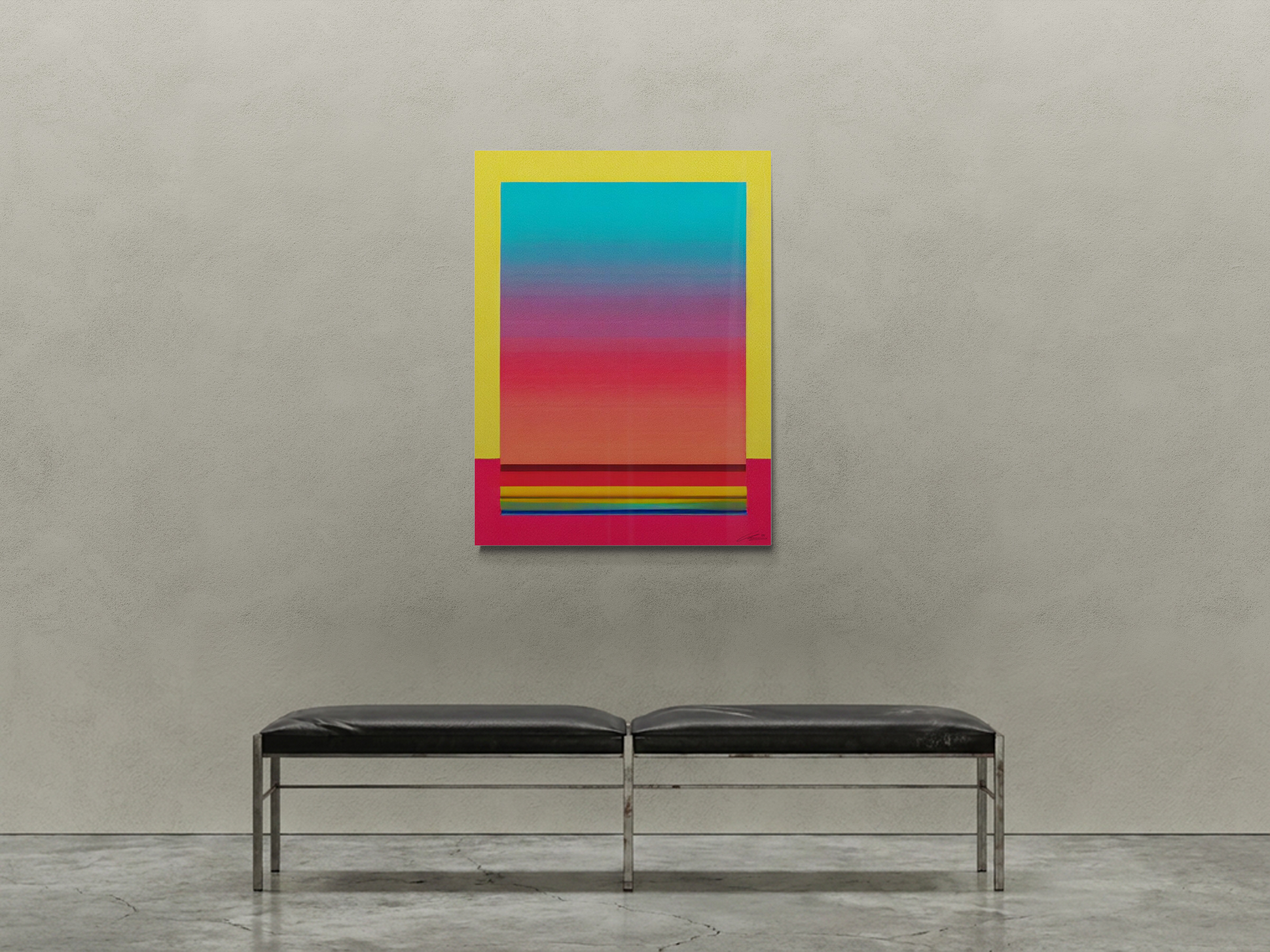
After the storm

Click to enlarge

Endless Summer serie · by vonMoerenburgh

After the storm

Original digital-to-physical · Aluminium panel, UV ink, crystal glass pigments, high-gloss automotive clear coat

$6,300

The geometric shapes at the base are what most people notice second. First is the gradient, the blue pulling away overhead while the warm register rebuilds from the bottom of the frame. Then the shapes: specific, hard-edged, holding their ground. The work reads differently in morning light than in evening light, which is consistent with what it is about.

No payment now — the artist will contact you personally.

Details

Dimensions

75 × 100 cm

Weight

4 kg

Subject matter

Post-storm sky gradient from cool blues to warm reds, with geometric shapes at the base

Medium

Aluminium panel, UV ink, crystal glass pigments, high-gloss automotive clear coat

Suited for

BedroomLiving roomOfficeRestaurantHotel lobby
Fire rated: D-s2,d0Commercial license

Share

From the studio

I was on Happy Street in Maui, on the slopes of Haleakala. After weeks of sun a big storm came down the volcano. When it passed the sky was reordered: blues overhead, warm light pushing back up from below, and the rain still moving downhill in visible sheets. The rainbows formed below us because we were above them. That was the image: looking down at the clearing, not up at it.

vonMoerenburgh

Living with this work

The gradient is what you see first and what you live with daily. The crystal glass pigments are what you discover over time. They are only visible in direct light and only if you are close. Most collectors report noticing them for the first time weeks after the piece goes up, when the light hits at a particular angle and the surface does something unexpected. That moment of noticing is repeatable. It happens to every person who stands close enough to look properly.

Where it lives

Room by room: where this work thrives, where it struggles, and exactly where to hang it.

Room fit

This work performs across a wider range of lighting conditions than most in the collection. Natural daylight brings out the blue register; warm artificial light advances the reds. Both readings are complete. It works on neutral and white walls, and holds its own in rooms with strong natural light where other works in this collection would struggle. Position at 145 cm to center with at least 1.5 meters of clear viewing distance.

Good fit

The warm reds advance under evening light, making the piece more energized as the room dims. Position it on a wall that receives morning light for the full range: cool blues at dawn, warm reds by lamp. A bedroom that needs to feel larger will benefit from the upward pull of the gradient.

Work size75 x 100 cm
Hang height (center)145 cm
Wall coverageN/A
Ideal viewing distance1.5 - 2 m

About the artist

V

vonMoerenburgh

The Hague, The Netherlands

48,000 miles. Panama to New Zealand, Brazil to Hawaii. vonMoerenburgh was crossing the Pacific, then crossing it again, from a different angle. The ocean kept finding him. Eventually, he stopped leaving.

He came to art late. Thirty years in design, gaming, and publishing, then at 49, he started making art. The work is built on a digital foundation, finished by hand with crystal glass pigments that shift with the light. The same surface reads differently depending on where you stand and what the light is doing.

He always meant to go to art school. This is what happened instead.